While snazzy interactive landing page elements engage customers and boost conversions, 37% of your visitors will simply click off your site if it takes longer than five seconds to load.
Instead, try using clever landing page optimization techniques to optimize your site for conversions without slowing down processing. And one way to achieve that is by building a design team to create a landing page designed to convert visitors into customers.
Need inspiration? Check out these superb landing page elements that won’t impact your website speed.
How Do Landing Page Elements Slow Page Performance?
While 70% of people say that page speed impacts their decision to buy, 85% of websites are slower than they should be.
This is because the elements within the website design are ‘heavy’, slow or broken. Slow landing pages can be attributed to:
- Really large content (like large photos or videos)
- Page elements that need a lot of computer power to function (like interactive elements)
- Broken connections (like bad links)
- Slow routing (like having too many 303 redirects)
For example, imagine a page of text versus a video. Obviously a user’s computer needs to do more work to load the video than the text.
If the potential customer has poor internet connection or the storage on their mobile device is nearly full, it’ll take ages to load or it simply won’t load at all.
In this sense, you want to use lightweight high performing landing page elements that don’t need a lot to load or don’t take up much space. When it comes to social media process like Instagram feed aesthetic, there are certain rules to be followed for visuals. Websites are no exception.
You also need to find broken or slow connections and reduce the friction in these channels.
Landing Page Elements That Won’t Impact Website Speed
You want a landing page that drives conversions but you don’t want to sacrifice speed.
Deploy lightweight landing page elements and clever performance hacks. Landing page optimization agencies can help you strike the perfect balance between design and performance. They understand how to create beautiful and engaging landing pages that also load quickly and convert visitors into customers.
Try these ten landing page elements for more advanced landing page optimization.
1. Header call-to-action button
Take a look at how capsule filling specialists, LFA Capsule Fillers, use a call-to-action button in the header:
![]()
Moving leads through the next stage to a discovery call, the button serves as a lightweight landing page element that doesn’t interrupt page performance.
As you can see, the button is clear against a whitespace background. This draws the eye to the call-to-action, without cluttering the space.
By clearing space around your CTA buttons, and designing with a clean, crisp feel, you can increase conversions by 232%.
2. Embedded Video Content
Video content directly uploaded to your website is a surefire way to slow down page speed. While things like great website protection can save you a bit in this case, you still need to ensure proper website speed as well.
Loading large, high quality video content is a laborious process.
To fix that, focus on instead embedding content from outside sources, like Wistia or YouTube. When considering video delivery options, explore the differences between unicast vs multicast to optimize your content distribution strategy.
Uploading your explainer video content to these platforms means less weight on your page, and less time to load.
For example, if you want to create product motion graphic animation for your SaaS tool, like Autodraw does…:
Embedding it via YouTube lessens the total page weight. As a result, website speed is not impacted.
3. Pop-up promotions
Outdoor pursuits brand, Gili Sports, uses a pop-up promotion to increase conversions on its landing page without slowing down the page performance.
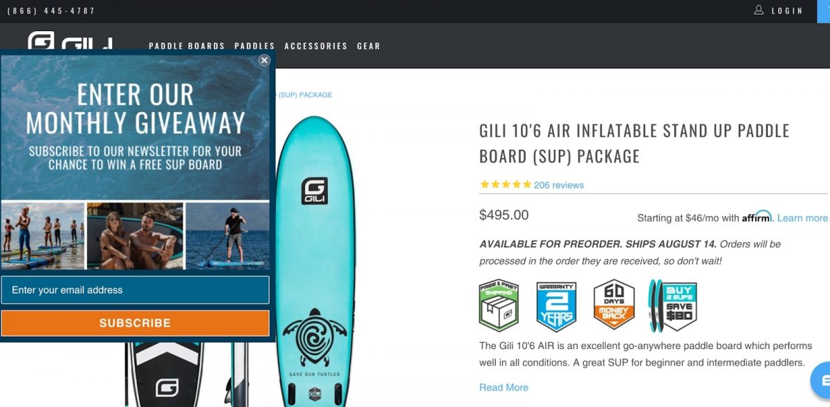
The average pop-up converts 9.28% of the time. This makes pop-ups a super effective landing page element to increase engagement and revenue. In fact, top-performing pop-ups convert up to 50% of the time!
But, it’s important to keep in mind the impact of pop-ups on your landing page speed. If your pop-ups include very large images and videos, they can significantly impact page performance.
Make sure to compress all images and cut video to less than 30 seconds. And if you feel like pop-ups are a bit too intrusive, you can always use a web push notification tool instead for a milder interaction experience.
4. A bold USP
See how Solgaard uses a succinct Unique Selling Proposition on its landing page:
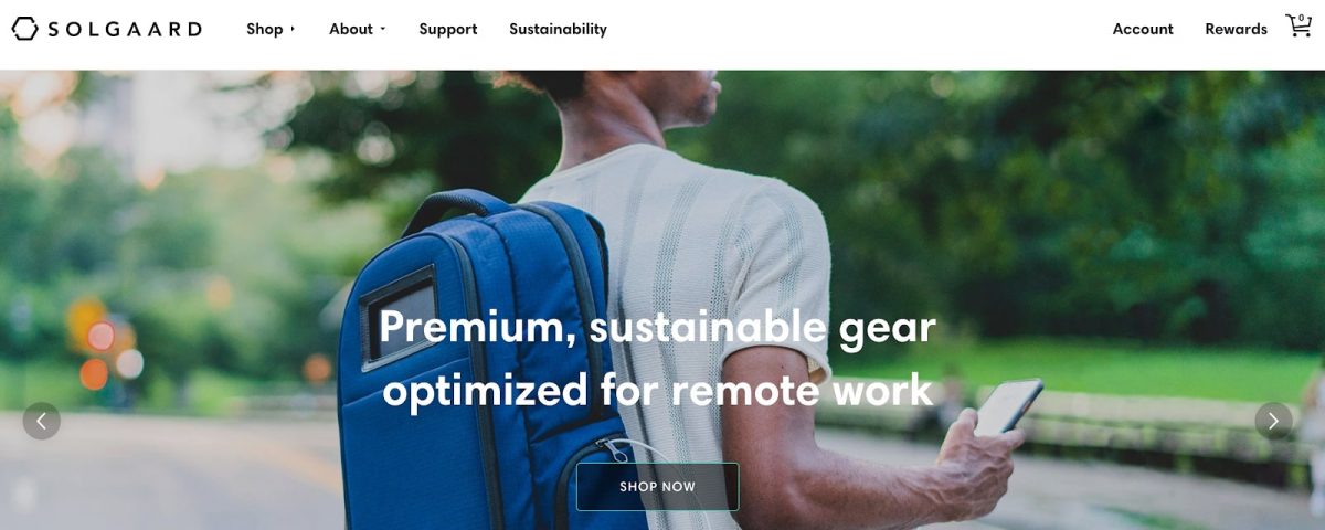
Posted front and center, the unique selling proposition lets customers know what the company does and who it targets.
Creating exclusivity, the unique selling proposition guides shoppers to connect with the brand. As 40% of shoppers will spend over and above to keep up with trends, creating exclusivity urges buyers to convert, which is data that can help you perform demand forecasting for the future.
5. Full-width banner image
Medical Alert Buyers Guide makes it clear and simple what it’s about on its landing page with a large banner hero image of the products the company reviews.
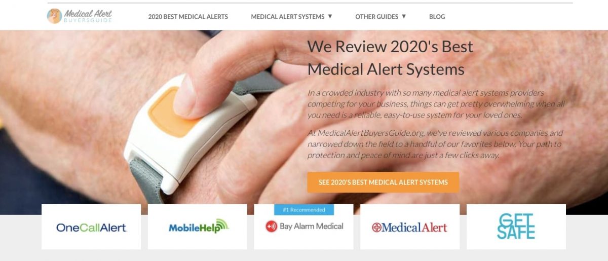
The crisp, high-quality header image showcases the products that are being reviewed, to signpost your target audience to quality content.
The banner hero image links to the same content as the call-to-action button, easing navigation.
To keep your banner images from interrupting your processing speed, make sure to compress the images.
Since 80% of your target audience will see this above-the-fold banner image, make sure it contextualizes your services instantly.
6. Listed benefits
Check out how Elemental Labs list the benefits of its health drink to specify who the product is for:
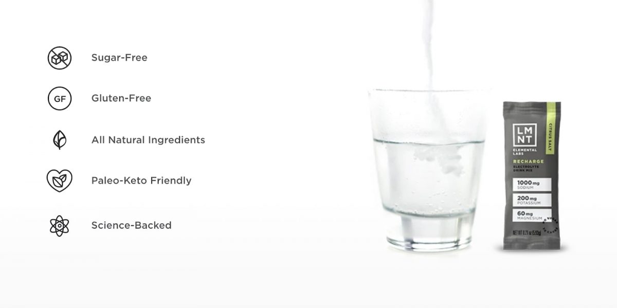
Since lists are the most popular format that people like to consume and share content, it makes sense to incorporate this simple landing page design element to show off your benefits.
Seeing as lists are only text, they won’t slow your web page performance.
Use lists to show the kinds of services you offer, the values you bring, and the types of customers you serve.
Pair your bulleted list with related icons, as shown above, to visually complement the content of the list.
7. Discount best-selling products
On Lumos’ high performing landing page, the revolutionary bike helmet brand directs visitors straight to its bestsellers.
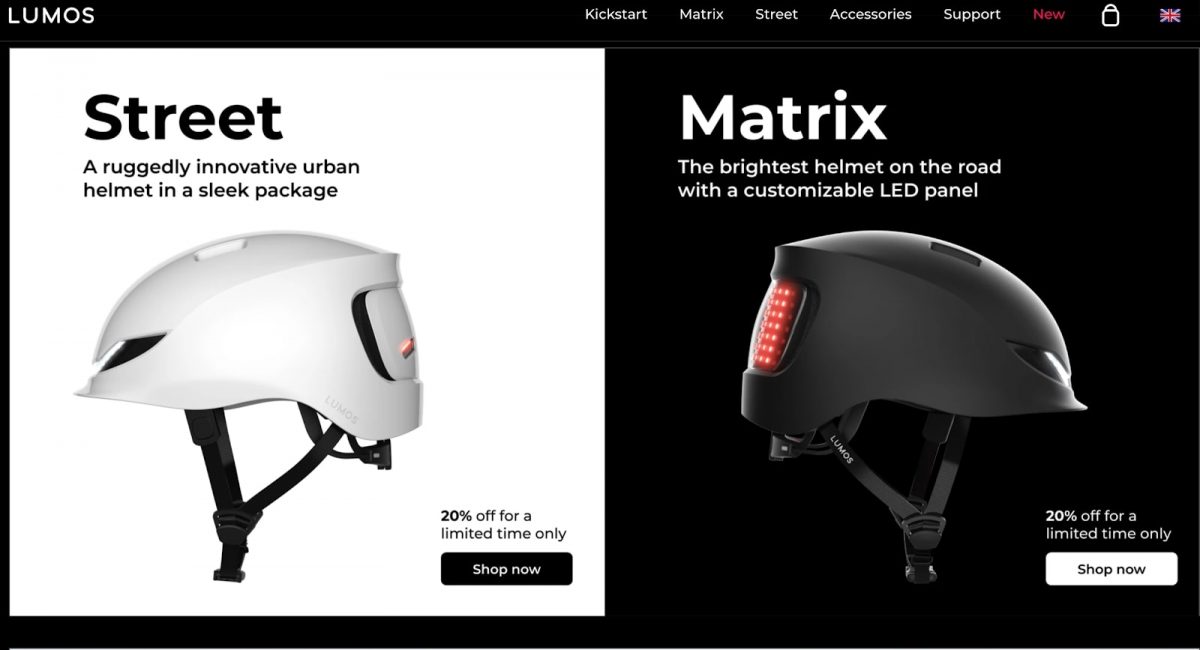
Notice how Lumos offers a 20% off limited-time only offer to incite urgency in buyers.
While these compressed images and call-to-action buttons have very little impact on website page loading speed, 80% of buyers will consider making a first-time purchase if they see a limited-time offer. People love to see discounted prices on their invoices and this is what discount marketing can achieve for your brand.
Add your bestsellers to your landing page and offer a catchy deal to hook customers when they arrive at your page. Also, using artificial intelligence, it’s possible to create a personalized recommendation system to boost sales. This personalized approach is a key component of a well-executed customer success process, ensuring that your customers not only make a purchase but continue to have a positive experience with your brand.
8. Short keyword-dense summaries on long landing pages
Look at how Sleep Junkie gives a short text summary above the fold, to encourage visitors to scroll down to find out more:
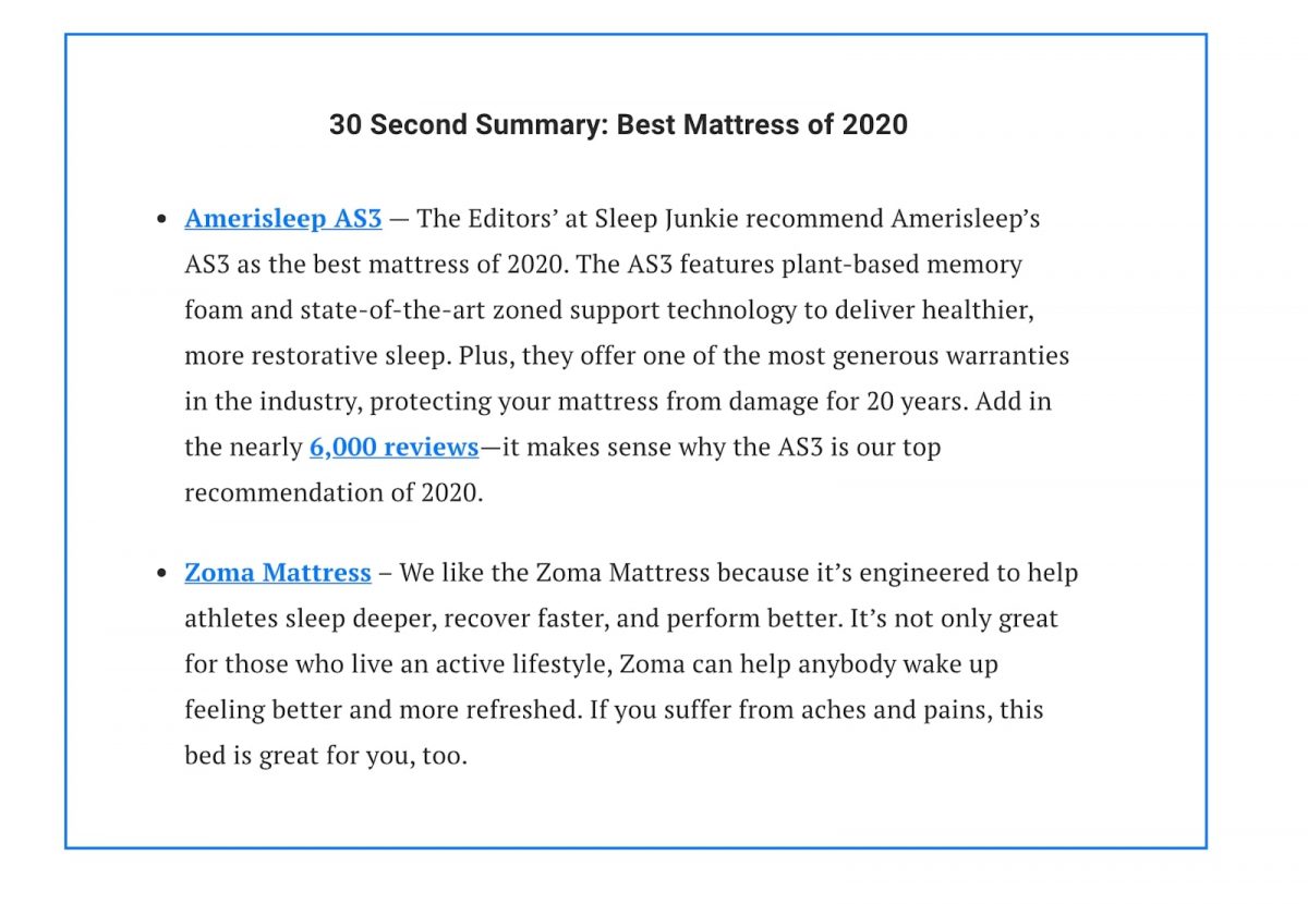
Notice how the short keyword-dense summary starts with a compelling headline to give the potential customer a clue of how long it’ll take.
By putting the summary at the top of the landing page, Sleep Junkie can cater to those looking for a quick read, while enticing them to spend more time on the page with detailed content below. This can be done effectively with a summarizing tool that condenses key points into a bite-sized format.
While many people think short landing pages work best, this is a fallacy. In fact, long landing pages can clinch up to 220% the number of leads compared to brief landing pages.
Add a short, highlighted summary to draw the reader in and set expectations. Use the space beneath the fold to outline your value in detail.
Since this entire technique only uses text, you won’t have to worry about compromising page speed.
As Aaron Haynes from Loganix puts it:
“Web visitors don’t want to spend time sifting through content to find out what your landing page is about. They want to know the solutions you solve instantly. Equally, a keyword-dense summary above the fold won’t just signpost your readers, it will also give your SEO a good boost.”
9. Mailing list lead capture form
Cleanup Colony invites leads to trade their data for discounts and community updates sent via a mailing list.
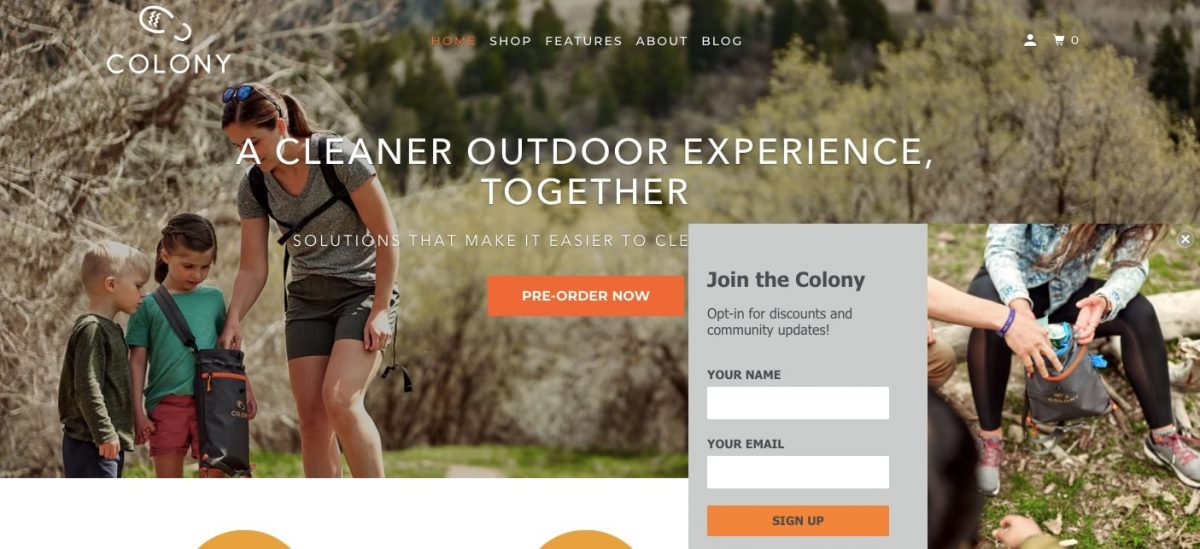
Since nearly half of all marketers say that landing page lead capture forms are their best lead generation tool, it’s wise to incorporate one on your page.
While pop-ups have great conversion rates, you can prevent your landing page form from impacting your page performance by embedding the form into your page.
Without the pop-up animation, the lead capture form will load much faster. You can use the best online form creators to build optimized popups for your landing on the website.
10. Social Proof
See how mobile form software app, Forms on Fire, uses testimonials as solid social proof of its high-quality tool:

Leveraging the strong reputations of G2 and Capterra, Forms on Fire embeds testimonials and ratings on to its landing page.
Taking up very little processing power, this testimonial gallery includes links to further reviews, plus a five-star system to signpost top-quality performance from the form app.
Consider that each testimonial on your landing page can increase conversions by 34%. This makes social proof one of the best landing page elements that won’t hamper speed. With a reliable landing page builder that easily integrates social proof elements like customer testimonials, you can create high-converting landing pages without sacrificing loading speed.
Conclusion
This article has given you a long list of different landing page elements that won’t affect your page’s speed. Sometimes, it’s also due to the external factors like ad blockers – in which case you cannot do much.
Remember to compress all images and videos before adding them to your landing page. Otherwise large files will slow down the performance, which will hurt your business.
If you have any questions about how to use landing page elements to improve page performance, don’t hesitate to reach out to the experts at euroVPS.


